Article
Dentist Website Redesign Example That Books More
September 17, 2026 • 6 min read
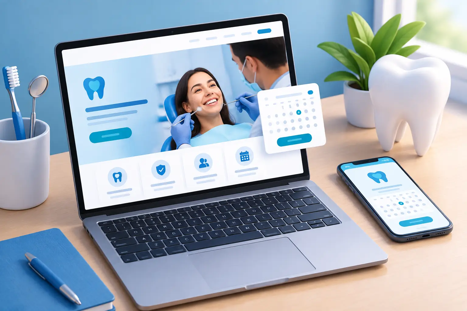
A dentist website redesign example is only useful if it shows what changes when the site is built to generate appointments, not just look more current. For a dental practice, the real test is simple: can a nervous new patient find the right service, trust the practice, and book or call without friction?
Many dental websites fail that test. They bury booking buttons, lead with generic stock photos, list every treatment with no clear priority, and make patients hunt for basic information such as location, insurance options, hours, or emergency availability. A redesign should fix the patient journey and the practice's lead handling at the same time.
The before: a website that looks fine but leaks leads
Picture a busy family dental clinic serving a competitive local area. Its old website is mobile-friendly enough, but it was built several years ago around a brochure-style layout. The home page opens with a wide image of a smiling family, a vague statement about quality care, and a menu containing 12 service pages.
The phone number is visible, but not clickable in a way that stands out on mobile. The appointment form sits on a separate page and asks for too much information before a patient can submit it. Reviews are present, but hidden several scrolls down. Emergency patients have no obvious path. New visitors cannot quickly tell whether the clinic offers direct billing, evening appointments, Invisalign, dental implants, or care for children.
This is not a design problem alone. It is a conversion problem.
A person searching for an emergency dentist at 9:30 a.m. is not studying brand language. A parent looking for a dentist for their child wants reassurance, availability, and a quick next step. Someone comparing implant providers wants proof, clear treatment information, and an easy way to request a consultation. When every visitor gets the same generic page, the practice makes people work too hard.
Dentist website redesign example: the after
The redesigned site starts with a clear, location-focused message: the practice name, the main patient need it solves, and two direct actions - call now and request an appointment. On mobile, those actions remain visible as patients scroll.
Instead of treating every service equally, the home page directs visitors into the highest-value and highest-intent paths. A clinic may feature emergency dentistry, new patient appointments, family dentistry, Invisalign, implants, and cosmetic treatments. The right mix depends on the practice's capacity, margins, and local demand. A clinic trying to fill hygiene schedules should not lead with implants if it cannot respond quickly to implant inquiries.
The redesign also puts trust near the decision point. It includes recent review highlights, dentist credentials, real clinic photography, financing or insurance details where applicable, and a concise explanation of what a first visit looks like. These are not decorative sections. They answer the questions that stop people from booking.
A clearer home page flow
A high-performing dental home page often follows the order patients already think in. First, they need to know they are in the right place. Next, they want confidence that the practice is credible and convenient. Finally, they need an obvious route to contact the office.
For this example, the page opens with a direct headline such as, “Family, emergency, and cosmetic dental care with appointments that fit your schedule.” Under it, a short supporting line mentions the neighbourhood or service area, accepted patient types, and the primary call to action.
The next section presents key treatment paths with plain-language labels. “Tooth Pain or Emergency?” gets its own priority card. “New Patients” has a separate path. “Straighten Your Smile” and “Replace Missing Teeth” can direct visitors to Invisalign and implant consultation pages. This reduces the number of decisions a patient has to make.
Further down, the site shows real patient feedback, answers practical questions, introduces the clinical team, and displays a map, hours, parking details, and contact options. Each section has a job. If a section does not help a visitor trust, understand, or contact the practice, it does not deserve prominent space.
Service pages built for search and action
A redesign should not send all traffic to one polished home page. Individual service pages matter because local patients search by problem and treatment. They search for terms related to emergency dental care, dental implants, Invisalign, teeth whitening, root canals, or dentists accepting new patients.
Each page should explain who the treatment is for, what the process generally involves, and how to take the next step. It should answer realistic concerns without making promises that belong in a clinical consultation. For example, an implant page can address candidacy, timelines, and consultation requests. An emergency page should make same-day calling instructions impossible to miss.
The best pages are specific without being overloaded. Long blocks of clinical copy may satisfy no one if the key action is buried at the bottom. Use clear headings, short explanations, practice-specific proof, and repeat contact options at natural points on the page.
What changed behind the scenes
The strongest redesigns connect the website to an operating system for lead capture and follow-up. A form submission that sits unread for hours is not a lead-generation system. It is a missed opportunity waiting to happen.
In this example, appointment requests flow directly into a centralized CRM. The patient receives an immediate confirmation message, while staff receive a notification with the service requested and contact details. If the inquiry arrives after hours, an AI chat or voice reception system can collect the essential information and set expectations for follow-up.
This matters because speed-to-lead changes outcomes. The practice does not need another dashboard for staff to check all day. It needs a process that captures the inquiry, confirms it, routes it to the right person, and flags it until someone responds.
Review generation can also be connected to the patient experience. After a completed visit, automated review requests help the clinic build fresh social proof over time. Those reviews improve trust on the website and support local visibility in Google results. Website conversion, reputation, and local SEO are not separate projects. They reinforce each other.
What to measure after launch
A website redesign is not finished on launch day. The practice should track whether the new site creates more qualified patient conversations, not just more page views.
Start with calls from the website, appointment requests, chat conversations, and completed bookings. Then look at where leads come from and how quickly staff respond. A page that generates fewer forms but more booked implant consultations may be more valuable than a high-traffic page that attracts unqualified inquiries.
Also review mobile behaviour. Most local dental searches happen when people are away from a desk, often with an immediate need. If mobile visitors cannot call, request an appointment, find directions, or understand the offer within seconds, the redesign still has work to do.
For practices in competitive markets such as Barrie, Newmarket, Aurora, and Vaughan, local visibility adds another layer. A well-built website gives Google clear service and location signals, but rankings alone do not pay for the site. The patient experience after the click determines whether visibility becomes revenue.
When a redesign is worth it
A full redesign makes sense when the existing website is slow, difficult to update, confusing on mobile, disconnected from lead follow-up, or failing to reflect the services the practice wants to grow. It is also justified when the clinic has expanded, added providers, changed locations, or wants to compete more seriously for high-intent treatments.
A full rebuild is not always necessary. If the site has sound technical foundations and good organic visibility, targeted conversion improvements may be the smarter move. Updating service pages, simplifying forms, improving call-to-action placement, adding review proof, and connecting CRM automation can produce meaningful gains without starting from zero.
The right decision comes down to the bottleneck. If patients cannot find you, focus on local SEO. If they find you but do not contact you, fix the website journey. If they contact you but disappear, fix follow-up. Growth gets easier when the whole system is managed as one process instead of a collection of disconnected tools.
A dental website should give your front desk fewer loose ends and give prospective patients one clear reason to act now: this is the right practice, and booking is easy.
Allan Heath
Founder of Ignite Leads. Helps local businesses grow through SEO, lead generation, and marketing automation — simplifying the playbook so owners can focus on the work.